This is the third post on building Arrow, an Android puzzle game. The first two are Learnings from building Arrow, a mobile game and Setting up a Flutter project for Claude Code.
Where this started
Some time back I watched an episode, Why are Indian cities still inaccessible to people with disabilities? It isn’t about apps. The people on it talk about disability rights, and about how our cities and infrastructure aren’t built with disabled people in mind. They put it so well that it really opened my eyes.
Why it matters
About 1.3 billion people, 1 in 6 worldwide, live with a significant disability, according to the WHO. In India, the 2011 Census counted 2.68 crore people with disabilities.
Most developers, me included, aren’t really aware of this. I wasn’t, until that episode.
Having the resources to build software at all is a privilege, and I feel it’s my responsibility to make what I build accessible to everyone. Making the tech accessible isn’t enough on its own. But it’s something I could do, so I did it for Arrow.
A game you play by looking
Arrow is a visual puzzle. Bent arrows on a grid, and you tap one to slide it out the way it points. It’s easy to assume a game like that can only be played by looking at it, and with a finger, quickly.
Each of those assumptions leaves someone out. Here’s what it took to change that.
A board a screen reader can read
People who are blind or have low vision use a screen reader: the phone reads out what’s on the screen, and they move through it and act on it by touch. If an app doesn’t describe itself, it’s silent, and there’s nothing to do.
That was Arrow. The board is drawn on a canvas, so to a screen reader it was one blank picture.
Now every arrow still on the board is its own button, with a label that says what a sighted player would see:
Arrow pointing right, 2 cells long, head at row 2, column 3. Clear path to the edge.
If the path isn’t clear, the label says how far ahead the blocking arrow is. Double-tapping an arrow plays it. The clock, the count of arrows out and the lives are read out, each arrow that leaves and each life lost is announced, and when a level ends, the result card announces itself.
A keyboard instead of a finger
Not everyone can tap, swipe or use a mouse. People with motor disabilities often rely on a keyboard, or on switches and other tools that act like one. WCAG, the web’s accessibility guidelines, asks that everything can be done from a keyboard.
In the browser version of Arrow, the arrow keys move a cursor from arrow to arrow, Enter plays the one under it, and a ring on the board shows where the cursor is.
Less motion, and more time
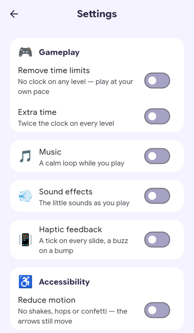
Reduce motion. For people with vestibular (inner ear) disorders, movement on a screen isn’t just decoration. It can bring on dizziness, nausea and headaches. In Arrow, a bump shakes the screen and a cleared level throws confetti. With Reduce motion on, or the phone’s own reduce-motion setting, that all stops. The arrows still slide out, because that motion is the game.
Time. A clock that feels brisk to me can make a level impossible for someone else. People with physical disabilities often need longer to react, people with low vision need longer to find things on screen, and screen reader users need longer to understand the layout. That’s why the guidelines ask for time limits that can be adjusted. Remove time limits takes the clock away, and Extra time doubles it.
Seeing and tapping
- Contrast. People with low vision often can’t read text that doesn’t stand out from its background. Every pair of text and background colours in Arrow meets the WCAG AA contrast ratio of 4.5:1, in both light and dark themes, and nothing is told by colour alone.
- Text size. Many people set a bigger font on their phone. Arrow follows it, and nothing sits in a fixed-height box, so larger text grows the layout instead of getting cut off.
- Touch targets. A small button is hard to hit with a hand tremor, with one hand, or on a moving bus. Everything tappable in Arrow is at least 44 pixels. On the biggest boards, where the cells themselves are small, zoom helps.
Making sure future changes don’t undo it
Accessibility isn’t done once. Every new screen, button or colour is a chance to break it without noticing, especially when an agent is writing most of the code. So every pull request is checked against the same standards:
- Flutter’s accessibility guideline checks run over every screen in both themes: tap target sizes, labelled buttons and text contrast.
- Tests pin the behaviour described above, from the arrow labels to the keyboard cursor.
- An Accessibility workflow posts the results on the pull request, along with before-and-after screenshots with the changes boxed.
So a change that breaks one shows up on the pull request, before it reaches anyone’s phone. How the checks run is in Setting up a Flutter project for Claude Code.
Just getting started
For most players, none of this changes anything. The game looks and plays the same. But if it makes the game better for even one person, it’s worth it.
An accessible app won’t fix a footpath or a bus. For me, it came down to doing the part that was in my hands.
I’m only getting started with accessibility, and I’m sure there’s a lot I’ve missed. If you spot something, or have an idea that would make Arrow better for anyone, please raise an issue or a pull request. All sorts of changes are welcome.